Any Program That Wants to Engage With Its Consumers Must Effectively Communicate Its Brand.
These Applications Communicate Their Brand Message Through Visual Designs.
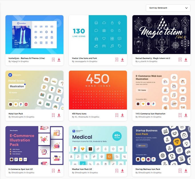
Icons Are One of the Finest Ways to Communicate a Brand’s Personality.
On a Graphical User Interface, Iconography Communicates via Color and Style.
Icons Communicate Ideas Using Tiny, Abstract Forms.
Icons in User Interface Design Make a Screen Simpler to Read.
User Interaction is Possible via Icons.
A Universally Recognized Picture That Can Be Understood in Any Language or Culture.
As a Graphic Designer, It is Our Responsibility to Produce Symbols That Are Not Only Clear and Appealing to the Eye but Also Whose Meaning is Instantly Understood by Users.
Benefits of using an icon in a GUI:
- You can communicate more words in a lesser space by using icons.
- Icons easily fit a finger-operated user interface and also work well with a mouse cursor.
- It is easier to create a brand recall if you have a distinct icon.
- You break language barriers by using icons. You do not need to worry about the need to translate your icons for international users. However, keep in mind the cultural differences while creating an icon to avoid any confusion or miscommunication.
- Icons enhance your design and are appealing to the eyes.
Tips to improve iconography
Icons must express meaning in order for people to understand what they stand for without having to take the effort to do so.
The icon you design will be your first opportunity to communicate the message of your app.
Do your research before you begin making an icon.
The icons that are frequently used on your target platforms should be known to you.
Additionally, bear in mind the symbols that your rivals employ because doing so will greatly aid you in avoiding making the same blunders they made.
Here are some pointers to help you develop your iconography.
- Consistency: When building icon sets for your app, be consistent. Keep the color combinations, forms, and stroke thickness constant. To obtain accurate readings, use a suitable grid system. This provides your UI a premium vibe and tells them you know what you’re doing.
- Convey a distinct message: An icon should be able to concisely express what it represents, be readable, and capture the soul of the brand. An effective emblem should be easy to recognize and relate to the brand.
- Keep it Simple. Giving too much detail will confuse the user: We are all aware that a picture is worth a thousand words. Keep your icons as basic as possible. These days, keeping designs simple is fashionable and also far more aesthetically pleasing. Always try to prevent looking cluttered.
- Stick to limitations: Before you create your symbol, you must take design constraints into account. You should frequently consider if the message is appropriate for the user or delivers the relevant meaning. Try to utilize icons like Search, Add, Hamburger, and Home wherever they are needed.
- Create an interesting, yet metaphor for the icon: Icons are created to symbolically represent ideas or actions. A combination of words that describe one thing in terms of another is called a metaphor. For instance, time is money.
Therefore, metaphors are essential for rapidly communicating to the user the meaning of these acts or concepts.
Few examples:
- We can use smilies with different expressions on various occasions.
- Laughing icon for positive action, the sad icon for failed/negative action, etc.
- Using umbrella icon to represents insurance, protection, etc.
- Pin icon represents the mail attachment.
Conclusion
To create stunning and captivating icons for your design, do your research and take your time.
The user interface is improved when icons are used appropriately and effectively.
Users must be guided by icons, and they should have a purpose.
The use of icons may improve or break a user interface’s usefulness.