Social Media Graphic Design Tips And Templates For 2023
Many of you, despite never having met them, glean advice and ideas from social media and the pages of individuals you like. The impact a social media site may have is so significant that you follow them by scrolling through their feed. So why not learn some important advice for yourself? Learn the basic visual design principles and templates for social media in 2023. You are exposed to and enticed to express your own thoughts after you get acclimated to social media and begin to accept others’ viewpoints.
Now, you must understand graphic design for social platforms if you want more people to participate with your post and if you want to draw in a sizable audience to read your opinion or watch your social media post.
Choosing the proper graphics for your article can help you attract the right readers and views. You should get knowledgeable about the many types of material that each type of graphic design will deliver. In this piece, we’ll discover some crucial social media graphic design advice and the newest and most effective social media templates for 2023.
Use Neon Theme or Bright colors
A bright hue will always be seen by the eye before a dull or dark one. Use a darker-colored design and experiment with adding vibrant images or neon-colored text on it. Use images and text in a slightly darker hue if you are utilizing a lighter or brighter template. This will contrast well and draw readers to your content. Good social networking templates are now simply accessible on several internet programs and websites. Another trending topic is neon.
Due to how well it highlights objects, makeup professionals, bloggers, and vloggers all use it. People would like visiting your website or any other social media platform if you use brighter colors to make your feed appear fascinating and happy.
Use Icons and Pictures
When shown alongside words, images convey much more. Whenever you submit anything legible, consider using a photo or an icon to serve as an illustration. Icons and pictures make a scenario more relevant, understandable, and help the mind land on the proper idea. a template created to coordinate with the content you need to upload. As they represent and reflect the sort of material you have shared, images and symbols also aid visitors in deciding if they want to keep reading or watching your article.
Create Different and Unique illustrations
One of the most well-liked and in-demand graphic layouts on social media right now. Consider using or coming up with better ways to show your argument about sharing the material. Doodles or other forms of visual art are being used by people to create an effect on viewers. Make a visual that indirectly conveys your content. Use the environment to convey freedom or solitude, the heart to convey connection, etc. It’s only a metaphor being used in a visual. More than anything else, art and its form fascinate viewers.
Use Charts and Graphs
The correct folks will be attracted by a graph or chart that illustrates the growth or comparison. People will follow a change for more when they see it, according to psychological research. People can better grasp and compare information using graphs and charts. A well-designed graph or chart may significantly alter a situation. Additionally, it aids in providing a clearer and more simplified view of the items or material. Additionally, it saves time that would otherwise be spent making an extra effort to mentally build an image or comparison. People would, therefore, without a doubt prefer to glance at a graph or a chart than read a lengthy chapter or report.
Use pre-made Social Media Templates
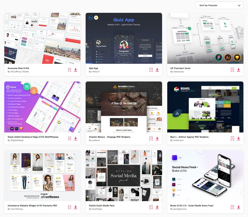
You are always welcome to utilize pre-made templates if you are new to social media, have no clue how to create templates for your feed, or cannot afford to hire a designer to do it for you. There are several websites and apps that offer templates for both free and for a fee. Premade templates may have text on them, but you can alter them with various editors. You are anticipated to have some understanding of editing if you plan to operate on social media sites that need solid visual design skills. If you’re not, you may still go online for inspiration and additional effects to add to your post.
When you first start a new job, this template concept is helpful. Afterward, you can invest and create one for yourself, and eventually, you will learn to create one by yourself.
Create GIFs and Cinemaclips
People enjoy seeing movies and the cinema. To offer a sneak peek at the stuff you’re about to deliver, you may develop a customized graphic interchange format, or GIF for short. This will draw in viewers who are interested and value your content and social media updates. When showing your material, graphic design is crucial.
No matter how fantastic your information is, if you don’t present it nicely, you’ll lose a lot of individuals who could have been interested. You may also include snippets from music videos, web series, or movie scenes to illustrate the feelings you were attempting to evoke in your message.
Highlight/ Bold the Title
Make the primary point of your material bolder than anything else to draw attention to it. Use a larger font size to emphasize the relevance of text contents. Highlighting the key points will draw the attention of the interested audience and let them know what you will be presenting. When creating a website, this graphic design concept will work out beautifully.
You may have observed that many programs, websites, or postings have larger text on their home pages than on other pages. It is a tactic used to draw attention to users’ postings. Also, draw attention to the term that best expresses the idea. Including a In a piece that offers graphic design inspiration, emphasize the phrase “graphic design.”
Graphic Design and Template Tips
Before creating a visual for your material, there are numerous things to consider. When creating, keep these in mind to ensure that the article has the most possible audience effect.
- Color
It’s crucial to pick the proper color for your article. Try utilizing red and yellow if you’re sharing food-related material, and muted hues if you’re writing about fashion. The color theory underlies a lot of things. Your feed can appear a chaos if you use any random colors.
- Shape Balance
Equilibrium in the posting of everything is crucial. Try to pick a template such that your feed has some symmetry while doing so. This draws attention since your feed appears organized and consistent.
- Lines
Although there may not be much of a distinction, in our minds, straight lines represent stillness and order, whereas curve lines create movement. Making the appropriate use of lines while designing makes a significant impact.
- Typography
Here, you search for the appropriate font size, font style, and font color. Typography is a distinct form of art. Always attempt to select the appropriate font style, color, and size when developing templates or forming graphic designs so that everything should link with one another and create the proper impression of your feed in the mind of the viewer.
- Contrast
Shapes, colors, sizes, images, and symbols may all be in contrast. The creation of a feed with some contrast is crucial. It gets catchy when the templates and graphic designs are arranged in accordance with their contrasting compatibility. It improves the appearance of your feed and gives it a cohesive, finished look.
- Scale
There should be a scale in the template and design you select. Some of your templates shouldn’t be significantly larger than others, and vice versa. Your feed will appear out of scale and so ugly as a result.
Your feed will seem like one and make better sense when everything is adjusted according to the scale.
- Direction
Always keep the direction in mind whenever you make a new template or visual design for your feed. Your feed should have instructions for the templates and designs to follow. Three different forms of direction exist.
Either in the “F” direction, “E” direction, or “Z” direction, people read.
- Repetition
The same fonts, colors, and design styles can be used. It appears as like you are attempting to cram multiple items into one photo that are not meant to be when you consistently use various styles in your feed. There is a sense of resemblance since these things are repeated.
Final Word
You should be aware of the following social media templates and advice. To expand your social media, apply these guidelines and the social media templates provided. If you need more inspiration, visit Designhill for suggestions on how to develop your social media following as well as the greatest social media themes.
